Let’s face it, people are busy, and time is precious. Whether they’re reading packaging, scrolling a website, or flicking through a presentation, they’re making quick decisions about what’s worth their attention — and what isn’t. They move fast because of the volume of visual and textual information.
When information is poorly structured, it doesn’t matter how good the content is. People tune out, miss the point, or, more likely, move on.
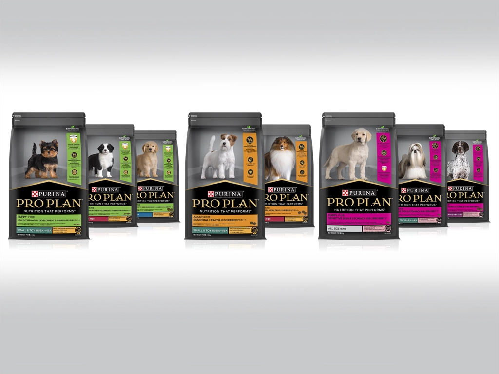
Visual hierarchy is how you address that problem. It’s the practice of arranging text, images, spacing, and colour so people naturally understand what matters most.
Here’s how it works in practice. Visual hierarchy is the way a design guides your eye — telling you what to look at first, second, and third without you having to think about it.
1. It tells people where to look first.
Not everything on a page carries equal weight, and your layout should reflect this. Strong headings, thoughtful typography, and clear spacing help people instantly identify the main message, supporting details, and any action you want them to take.
Without this, everything competes for attention at once — and nothing wins.
This matters most when people are making quick decisions: on packaging, in healthcare materials, across marketing campaigns, or during a boardroom presentation.

2. It makes content easier to read.
A well-structured layout doesn’t just look tidy — it also reduces the effort required to read.
When content is grouped logically, uses consistent type sizing, and breathes with good spacing, people can move through it naturally. They don’t have to work to find their place or work out what comes next.
This is particularly useful for anything complex: technical specifications, product information, healthcare content, or campaigns with many moving parts.
3. It creates consistency across everything you produce.
If your organisation produces a range of materials — packaging, digital content, printed collateral, and campaign assets — a consistent visual structure ties them together.
That consistency isn’t just about aesthetics. It makes your communication easier to recognise, easier to trust, and easier for your team to manage and scale.
4. It helps people understand quickly.
Most audiences decide within seconds whether something is worth their time.
Clear hierarchy does much of the work here. It signals what’s important, what’s secondary, and what action (if any) someone should take — without making them hunt for it.
The result is communication that’s easier to absorb and more likely to be remembered.

5. It shapes how your brand is perceived.
A cluttered, hard-to-follow layout creates friction — and that friction reflects on you.
On the other hand, well-organised communication feels considered and credible. It shows that someone thought carefully about the audience, not just the message.
For businesses in FMCG, healthcare, or corporate environments, that distinction matters. How something looks influences how seriously it’s taken.
The bottom line.
Visual hierarchy isn’t a design detail — it’s a communication choice.
Structure your information well, and you make it easier for people to understand, engage with, and act on it. Get it wrong, and even good content can fall flat.
Clear communication shouldn’t require effort from the audience. A good hierarchy does the work for them.