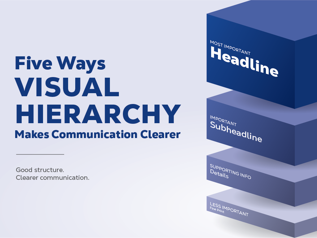
In graphic design, colour is one of the most powerful tools at your disposal. The right colour palette can encourage specific emotions, convey messages, and create an impactful visual experience. Whether you’re designing a website, a logo, or a marketing campaign, understanding how to use colour to influence emotions is essential. In this blog, we’ll explore the psychology of colour and provide practical tips on using colour effectively in your designs.
The Psychology of Color
Colour psychology is the study of how colours affect human behaviour and emotions. Different colours can elicit different feelings and responses. Here’s a look at some key colours and the emotions they influence psycologically:

Red: Energy and Passion
Red is a stimulating colour that often conveys energy, passion and urgency. It’s commonly used to grab attention and create excitement. In graphic design, red can be effective for call-to-action buttons, sale announcements, and bold accents.
Blue: Trust and Calm
Blue is associated with trust, calmness, and professionalism. It’s widely used in corporate and healthcare settings to create a sense of reliability and stability. Blue tones are ideal for backgrounds, logos, and designs meant to evoke a sense of trust and tranquillity.
Yellow: Optimism and Happiness
Yellow exudes warmth, optimism, and happiness. It’s the sunshine colour and can be used to brighten a design and create a sense of cheerfulness. Use yellow to draw attention to important elements or to add a touch of positivity. However, use it sparingly to avoid overwhelming or blinding the viewer.

Green: Health and Tranquillity
Green represents health, tranquillity, and nature. Thing of it as the grass colour. It’s often used in designs related to wellness, environment, and growth. Green can create a balanced and refreshing look, making it suitable for backgrounds, accents, and elements promoting well-being.
Purple: Creativity and Luxury
Purple combines the stability of blue and the energy of red, making it a symbol of creativity, luxury, and spirituality. It’s perfect for designs aiming to convey sophistication and elegance. Once a very difficult colour to reproduce it now is used symbolise and highlight premium products or to add a creative flair to designs.

Black: Power and Sophistication
Black conveys power, elegance, and sophistication. It’s often used in luxury branding and modern designs. Black can create a strong visual impact and add a touch of exclusivity. However, too much black can feel heavy, so balance it with lighter colors. Also, in some cultures black represents, well death. So be mindful how you use this colour.
White: Simplicity and Cleanliness
White signifies simplicity, cleanliness, and purity. That’s why Angels are always depicted in white. It can create a sense of space and openness in your designs. White is frequently used in minimalist designs and can provide a clean, uncluttered look. It pairs well with almost any colour, making it a versatile choice.
Practical Tips for Using Colour in Graphic Design

Here are some practical tips to help you use colour effectively in your graphic design projects:
Understand Your Audience: Different cultures and demographics may have different associations with colours. Consider your target audience when choosing your colour palette.
Create a Colour Palette: Develop a cohesive colour palette that aligns with your brand identity and design goals. Use tools like Adobe Color to find harmonious colour combinations.
Use Contrast for Emphasis: Utilize contrasting colours to highlight important elements and create visual interest. High contrast can make your design more readable and engaging.
Balance Bold and Neutral colours: Bold colours can draw attention, but too much can be overwhelming. Balance them with neutral tones to create a visually pleasing design.
Test and Iterate: Test your colour choices with your audience and be open to feedback. Colour, as well all know, can be very subjective. Make adjustments as needed to ensure your designs effectively convey or promote the desired emotions your clients wish to project.

Conclusion
Colour is a fundamental element of graphic design that can significantly influence emotions and perceptions. By understanding the psychology of colour and applying it thoughtfully, you can create designs that resonate with your audience and achieve your intended impact. Whether you aim to evoke excitement, trust, happiness, or tranquillity, the right colour choices can make all the difference.